Variable Fonts and Web Components
Variable Fonts is a pretty buzz buzzword in the frontend community. This is me spending the weekend working with web components and variable fonts.
Variable Fonts - an intro
There are alot of well written articles on variable fonts so I'll just say it is exactly what its name entails. You can customize your font as much as you want!
There are five variation settings at which you can vary them by
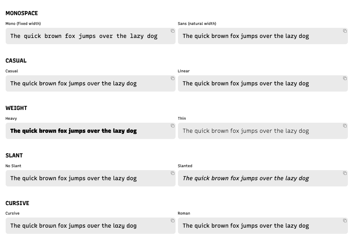
- Monospace: 0 to 1
- Casual: 0 to 1
- Weight: 300 to 1000
- Slant: -15 to 0
- CRSV (cursive): 0 or 1
font-variation-settings:
  "MONO" 0,
  "CASL" 0,
  "wght" 400,
  "slnt" 0,
  "CRSV" 0;
It is incredibly easy to set this up too, just add a link to the Google font in your html head. You can also customize the range of values you want to import as well.
<link href="https://fonts.googleapis.com/css2?family=Recursive:slnt,wght,CASL,CRSV,MONO@-15..0,300..1000,0..1,0..1,0..1&display=swap" rel="stylesheet">Atomico - Web Components
For my simple web app, I experimented with atomico which compiles jsx / js / md code into web components.
Pros:
- Relatively easy to set up (init script)
- JSX
- React Hook syntax, eg.
useStateanduseEffect
It is my first time working (almost) directly with web components. I had some pitfalls though, let me share some of my embarrassing moments.
Do not name custom elements with one word
One of my components was defined <block></block> and nothing rendered for the longest time lol. So kids, remember you must have a dash (-) so as to allow the HTML parser to distinguish between custom elements and regular ones.
<block-component></block-component>Do not give components generic props like title
<block-component title="my title"></block-component>When I tried to use the props title in my block component, nothing happened for the longest time. Then I realised that title / id is a HTML attribute for HTML elements.
I really should have known. Ugh so angry.
Parsing objects
I wanted to pass an object as a prop but only strings were allowed.
<block-component
  min='{
    "value": 0,
    "description": "Sans (natural width)"
  }'
  max='{
    "value": 1,
    "description": "Mono (fixed width)"
  }'
></block-component>
I did it in a roundabout way instead.
const BlockComponent = ({ min, max }) => {
  const [minInput] = useState(JSON.parse(min))
  const minAttributes = {}
  minAttributes[attr] = minInput.value

  return (
    <host>
      <div>
        <text-component {...minAttributes}></text-component>
      </div>
    </host>
  )
I am pleasantly surprised that this worked. Yay for jsx.
Shadow vs Light DOM
Shadow DOM is the dom in which a shadow root is attached to a component. A light DOM is the regular DOM tree inside a html element (just redefined to contrast with shadow).
Unless you define a <host shadowDom></host>, it is a regular/light DOM by default.
Concluding thoughts
I had a fun time exploring variable fonts, writing plain js and css. I really love writing one line responsive css with css grids and minmax.
I'm so excited to continue to explore the magic of css and html. !!!

Links and Resources
Did you know this was built with 11ty and tailwind? And works even with Javascript disabled? Yeah I don't care either.