Why you should consider antd in a React project
Ant Design is a popular Chinese React UI framework. In this article, I'll outline why I like to use Antd and some of the useful features I appreciate in this framework.
Some Context
So I've only ever used 2 UI frameworks in close detail - Material UI and Antd, so you will find most of my points done in comparison to Material UI. Disclaimer: Material UI is not bad but the point of this article is to show my appreciation for some antd features I really like.
Also, I was upgrading the antd package from 3.x to 4.x, a new major release. I encountered some breaking changes so I'd also like to talk about the new release changes.
Why I like antd
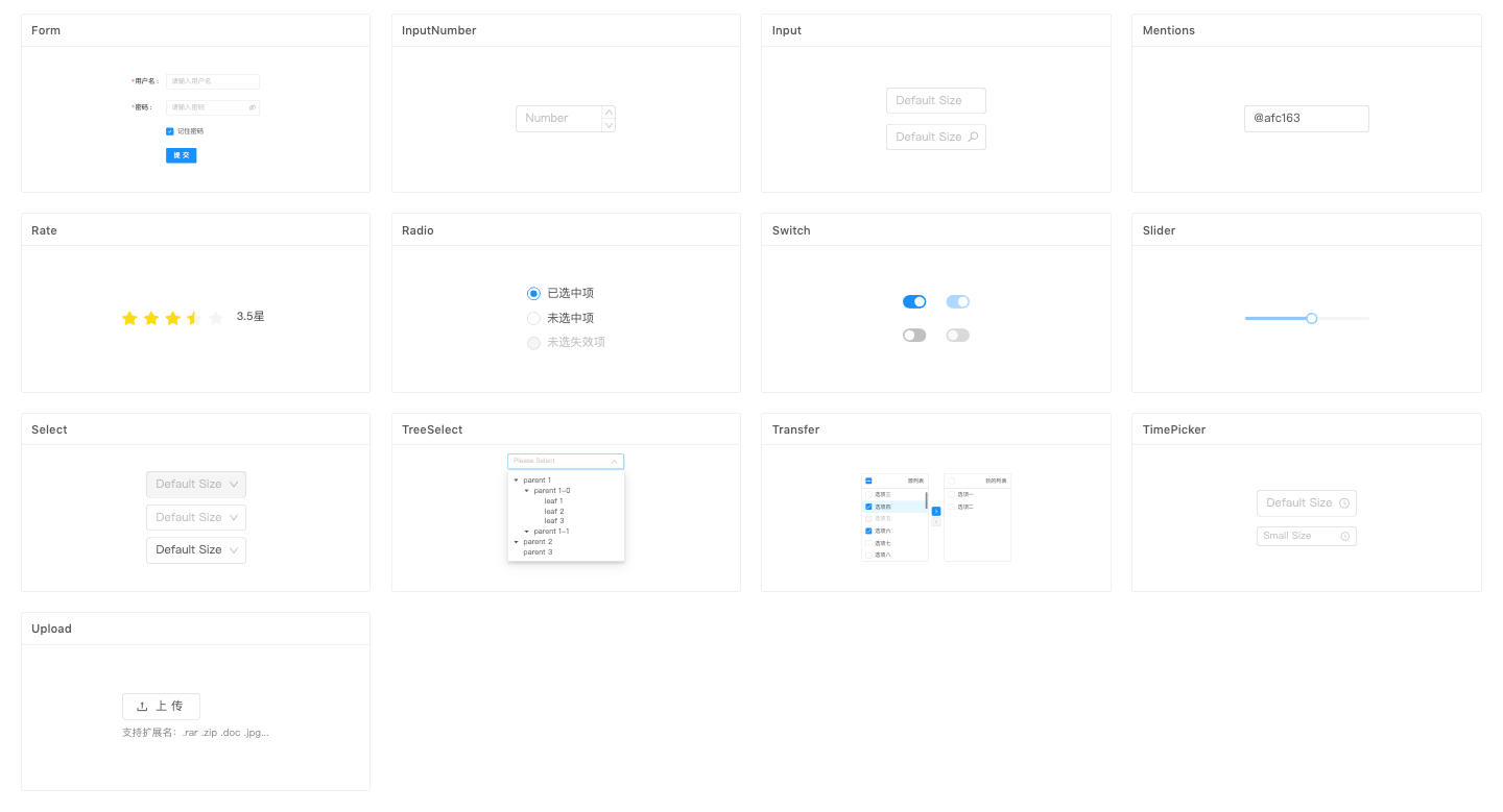
Variety of components
Antd provides a wide array of components, some worth-mentioning ones include calendar, empty, confirmation modals, skeleton, transfer, upload features. Upload in particular is usually a separate UI package I had to install for projects, but I was pleasantly surprised to find the Upload comnponent to include draggable files and many other API options.
It provides many easy to use components like PopConfirm which was something that had to be customized in another project. So I'd really appreciate how fast antd can get my project going with all these ready to use components.
They have almost everything I can think of and even more.
Clean Look
The components have a minimalistic feel to them. They are generally white, clean and have a good use of space. No complains there. It is beautiful.
Good UX Practices
I like how user experience has a very strong presence in the components. In a way, the components allow us to architecture UX into them, as compared to other frameworks where it is not part of the components then you have to create separate states or UI elements to help improve the UX.
For example, Buttons and Text have a loading state. I remember in one project, I had a loading variable and I had to write a conditional statement to display a custom made <Loader /> with absolute positioning in the button when loading is set to true. But in antd, you just have to pass a boolean variable into the loading prop of Button.
There is a component called Skeleton to buffer data that is still in the midst of fetching. And this component. can. pulse. ie. active animation.
There are a lot of other components like Spin, Empty, which help developers think about how they can improve UX in their project. It definitely made me think of how I could have done better. In the past, it might have been the time and effort to put UX considerations off, but with antd, there is really no excuse not to practise good UX practices in your project.
Antd has definitely made it a lot more accessible and easy.
Major changes from 2.x to 3.x
1. Icons have been refactored into a new package
This is not uncommon, Material UI Icons are in a separate package from the rest of its library. It is probably easier to maintain as a separate package and easier to update.
However, I did find it annoying and inconvenient during my upgrade process. I had to alter all the Icon imports from antd and import the icon components directly from the new package.
Also, I had to change the icon prop in components that allowed for an icon prop like Avatar.
It was a one-time upgrade, so enough with the complaining haha. Rant over.
2. Forms
How we commonly handle form elements in React
For each input element, there is a value prop that we set to this.state.name for example, and a handleChange handler this.handleChange("name") that essentially does this.setState({ name: event.target.value })
The way antd does it
Form has its own data scope. In 3.x, you need getFieldDecorator, now we can just use Form.Item, and add the name and validations to it directly.
Form listens to onSubmit in the past, but now it will listen to onFinish when all validations have passed.
Here is an example to illustrate my points:
<Form
    onFinish={this.handleSubmit}
    initialValues={ { nickname: "turt" } }
    ref={this.formRef}
>
    <Form.Item
        name="nickname"
        rules={[
            {
            required: true,
            message: "Please input your name"
            }
        ]}
        >
        <Input />
    </Form.Item>
    <Form.Item>
        <Button htmlType="submit">Save</Button>
    </Form.Item>
</Form>
There is no need to pass in state variables or handleChange methods. When you have entered a valid nickname, onFinish method will be called and you can retrieve the data from the form scope.
handleSubmit = values => {
    // values = { nickname: "turt" }
    //TODO
}
values will be an object with the name in your form item.
I was completely shocked about it. This feature was probably in antd 3.x and below but I did not use getFieldDecorator as the syntax was confusing and I did not know what a field decorator was. I'm glad for the upgrade as having the props in Form.Item is so much cleaner and readable, which increases maintainability.
It also means I can delete my state variables, my handleChange methods. Cool right?
I did find it annoying to clear the form though. Say you want to clear the form fields after a successful save, for Class componenets, you have to create a ref with formRef = React.createRef();, assign it ref to the form and call this.formRef.current.resetFields().
Summary
- Antd contains a good variety of clean, simple, user-friendly components
- Give it a go!
Thanks for reading till here!

Did you know this was built with 11ty and tailwind? And works even with Javascript disabled? Yeah I don't care either.