Revisiting Expense Tracker
So in 2018, I wrote my first react app with coupled with firebase myself. It served me pretty well - a basic crud for expenses. A year on, I decided to take a look at what I've done and do some much needed maintenance.
In Summary
In summary, I had:
- overhauled the UI twice (sigh)
- cleaned up the code (horror me at myself)
- upgraded packages etc
It was a fruitful maintenance! Felt alot of horror at my first foray into React and Firebase, one year on, I hoped I had matured and gotten more experience. The end result was quite satisfactory.
Cleaning Code
First thing I did was to clean up code. I was passing in my UID into every child component, which I found rather unclean to look at - hence I installed the redux packages.
- Yay to no more passing of props down this long rabbit hole
- Nay to using redux only for one purpose lol
I also cleaned up some code, rewrote some lines, made it look neat.
Overhauling UI
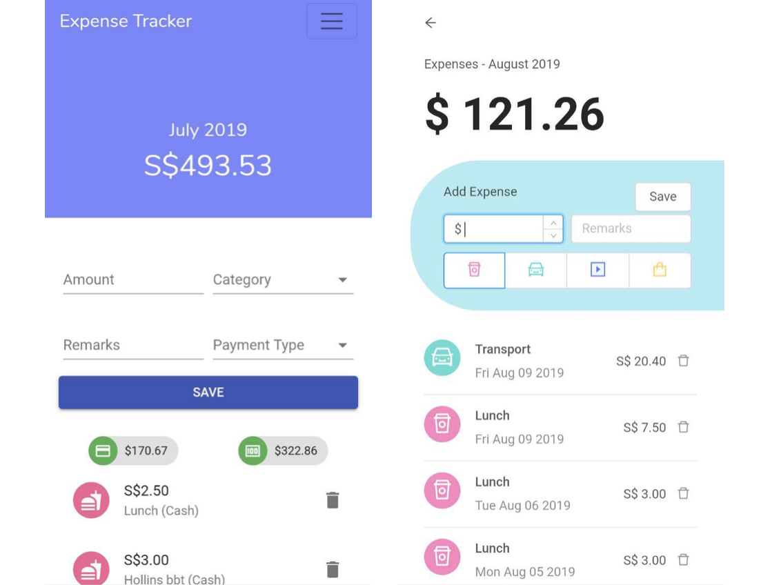 LHS was old app design, RHS was first iteration of the new UI. I overhauled the UI also because I wanted to try a new UI framework - [antd](https://ant.design/). It has tons of components and the clean and simple application of their usage had impressed me greatly! Totally would recommend.
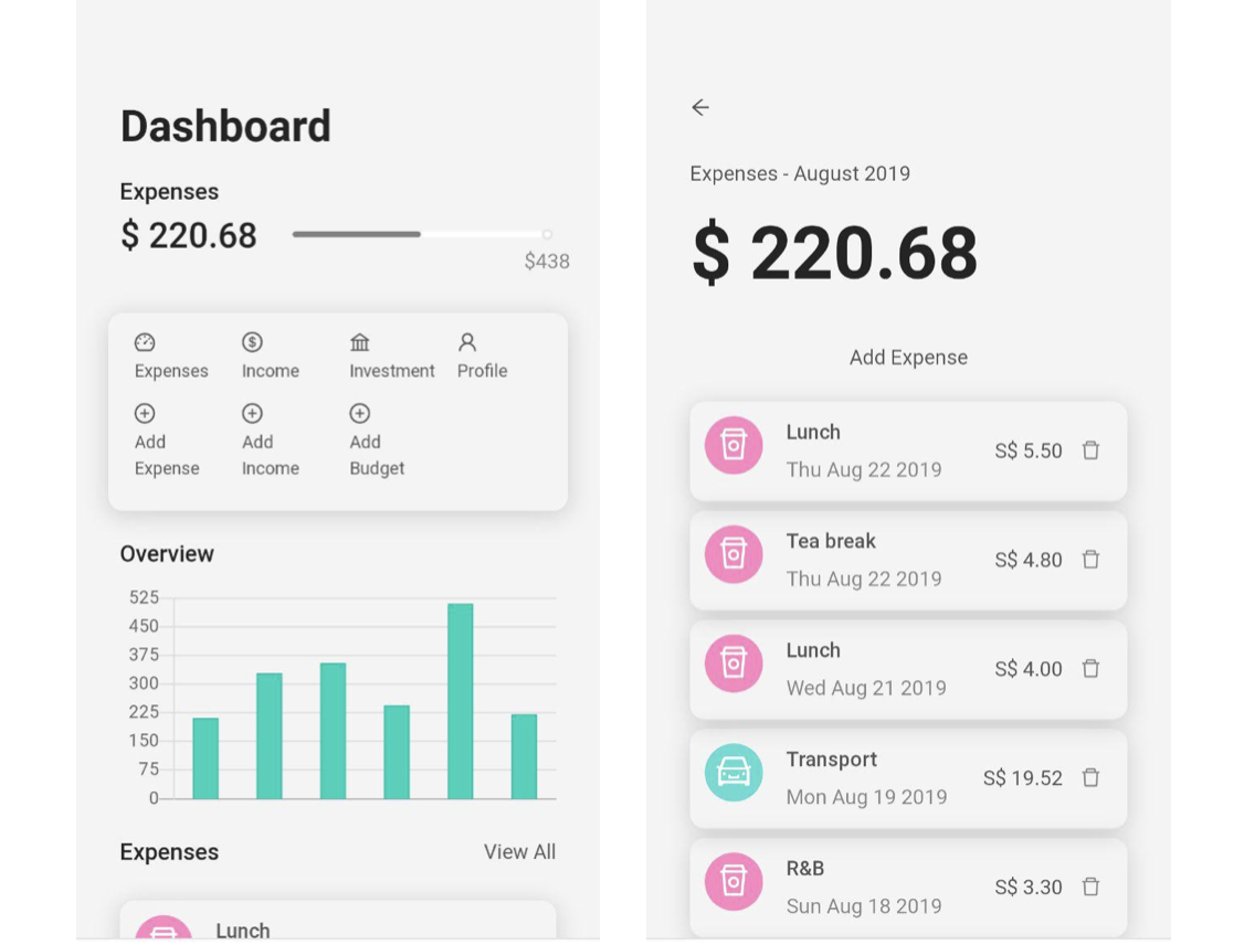
User Interface
I had simplified and made the UI much cleaner. Last time, flat colors were a big thing and I wanted a splash of alot of color. This time round, taking reference from other apps like Grab, Google, Carousell who were going with a light background, I also decided to let white be the dominant color of the app with a touch of secondary colors in icons and bars.
Navigation
The original UI designed for web, so this time round, I tried to design it with a mobile first mindset. I created my own menu / shortcut in the dashboard instead of having a tabbed bar at the bottom like regular navigation in native apps.
Organization
Previously, I used to prize efficiency and add expense at the same page as the expense list. In the end, it didn't really work out as I felt that the Creating and Viewing functions in one screen didn't give a very consistent look - so I decided to separate them and add nav links to them. I also placed creating expense as a shortcut on the nav bar on the dashboard.
Re-evaluating the Focus
In the past, I didn't have a dashboard page - it was an empty home page. This time, I had to think about what were the important things that I wanted to focus on. What was the core purpose that I wanted to achieve when I wanted to build this? I came up with:
- Keeping track of expenses on a daily basis
- as well as comparing it to previous months
That is why the dashboard clearly shows the past expenses in the past 6 months and provides also shortcuts to add/view expenses. I decided to do away with showing of income/investment as that was a good to have but not really priority. Deciding that the focus was on expenses, it helped to shape the look and focus of the app.
New Function
I only added a new screen - profile screen for inputing recurring income and investment expenses. I also added budget there so that you can track how much of your budget you have used.
Summing up & Takeaways
So, in conclusion, I am pretty happy with the new design. Maybe I'll feel differently one year from now haha.
Some takeaways I felt were important:
- I should do some mockups before proceeding, else I'll just need to overhaul more things
- Taking a step back, to understand from a macro point of view, what was important and priority for an app
Did you know this was built with 11ty and tailwind? And works even with Javascript disabled? Yeah I don't care either.