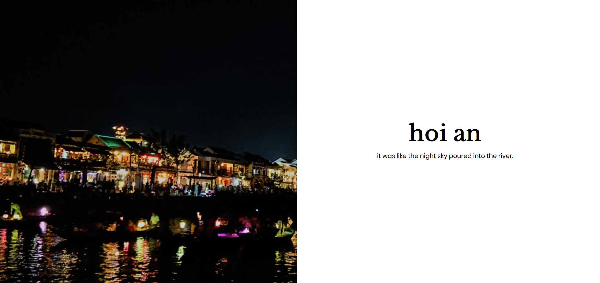
Da Nang
Hello, it took nearly 5 months to get the first post of the year out. So just some updates, ended SUTD end of April 2018 and immediately went on a trip to Vietnam with SUTD friends! We took advantage of the mayday weekend and went to Da Nang for a 5 day trip :) While on the trip, bosses at work were sharing an NY article and saying how interactive it was. So, I decided to see if I could build one from scratch as well!
So yes. Tldr, I did. See some of my photos and the final outcome here!
HTML Markup
So basically, the image will be fixed while text is scrollable. What I had in mind was a single 100% width and height section per image and caption and within that section, two
 <section class="page">
    <div class="page__image"></div>
    <div class="page__text">
        <div class="page__text--group">
            <h1>bana hills</h1>
            <p>a resort on a hill that was named after banana trees.</p>
        </div>
    </div>
</section>
I tried to follow BEM standards, using page as my block, page__image and page__text as my elements and lastly, page__text--group as a modifier (not really modifying but it was cool as an identifier).
Styles
For styles, it was kind of tricky at first. The key was giving the image a position of fixed and giving the text the position of absolute. The fixed position property will keep the image fixed as you scroll. However, without setting opacity: 0 you will realise that you can only see the uppermost image. Also, without setting top: 0, you will realise you can only see the first image.
section.page {
    width: 100%;
    height: 100vh;

    .page__image {
        left: 0;
        top: 0;
        width: 50%;
        background-size: cover;
        background-position: center;
        height: 100vh;
        position: fixed;
        opacity: 0;
    }

    .page__text {
        right: 0;
        width: 50%;
        height: 100vh;
        position: absolute;

        display: flex;
        align-items: center;
        justify-content: center;
        flex-direction: column;

        .page__text--group {
            width: 60%;
            word-wrap: break-word;
            text-align: center;
        }
    }
}
Images are loaded as background images. Instead of manually setting the images, I use a for loop in scss! Quite fun, although you still have to manually set the maximum number of images and also ensure the naming of your images is standardized.
@for $i from 0 through 7 {
    .page[data-page="#{$i}"] {
        .page__image {
            background-image: url("../img/img#{$i}-small.jpg");
        }
    }
}
Javascript
Alright, I use jQuery to help decide which page is active and which is not. I first create an array of all my pages. I keep track of the current page and what comes before and after it.
let slides = []
const PAGES = $('.page');
PAGES.each(function(index, value){
    this.setAttribute('data-page', index);
    if (index==0) {
        slides.push({
            current: this,
            prev: PAGES[PAGES.length-1],
            next: PAGES[1]
        })
    } else if (index==PAGES.length-1) {
        slides.push({
            current: this,
            prev: PAGES[PAGES.length-2],
            next: PAGES[0]
        })
    } else {
        slides.push({
            current: this,
            prev: PAGES[index-1],
            next: PAGES[index+1]
        })
    }
})
Then using the $(window).scroll event handler, we bind a function to it that calculates the pageYOffset (how far down the user has scrolled). I define a variable called page_progress which is the page offset divided by the height of the window. If the rounded number is larger than the current number of pages travelled, I increment number of pages travelled and fadeIn the new image so the the new image has an opacity of 1 and overlaps the previous images. So the logic is that we don’t remove the images, imagine the images all stacked on each other (because they have the same fixed position due to left: 0 top: 0;) and they are all transparent (opacity: 0). When I’ve scrolled past a certain limit, they become opaque. Image 1 is at the bottom, then Image 2 is stacked on it, meaning the last Image is right at the top of the stack. (On hindsight, is it a stack implementation?) Somewhat haha.
const height = $(window).height();
let num_pages_travelled = 0;
const max_pages = $('.page').length - 1;

$(window).scroll(function() {
    let page_progress = Math.round(this.pageYOffset/height);
    page_progress = Math.min(page_progress, max_pages);

    if (page_progress > num_pages_travelled) {
        num_pages_travelled++;
        let next = $(slides[num_pages_travelled].current);
        next.addClass('active').removeClass('inactive');

    } else if (page_progress < num_pages_travelled) {
        let past = $(slides[num_pages_travelled].current);
        past.removeClass('active').addClass('inactive');
        num_pages_travelled--;
    }
});
Image Transitions
I used CSS animations and keyframes to animate fade in and fade out tranisitons by altering opacity of the images.
.active {
    .page__image {
        animation: fadeIn 0.4s ease both;
    }
}

.inactive {
    .page__image {
        animation: fadeOut 0.4s ease both;
    }
}

@keyframes fadeIn {
   0% {opacity:0;}
   50% {opacity:0.5;}
   100% {opacity:1;}
}

@keyframes fadeOut {
   0% {opacity:1;}
   50% {opacity:0.5;}
   100% {opacity:0;}
}
The animation is applied on classes which would be added or removed on the HTML elements using jQuery.
Responsiveness
Add media query at the 767/768 breakpoint! So now the image and text both take up 100% width and the text is placed at the top. It has a nice scrolling/parallax effect that was kind of unintended hehe.
Image Resizing
My images were taken with a semi-good camera. The dimensions were like ranging from 2000 pixels x 1000 pixels. Granted, the loading speed for images was so high it took too long to load the page.
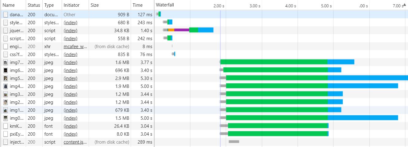
It took 7 seconds (LOL so embarrassed). I had the website up and the scrolling up, I was very proud already. Then come optimizing which is something equally important. We all understand that people on the web can be so impatient and its important to serve files quickly. Thankfully there were two easy remedies:
-
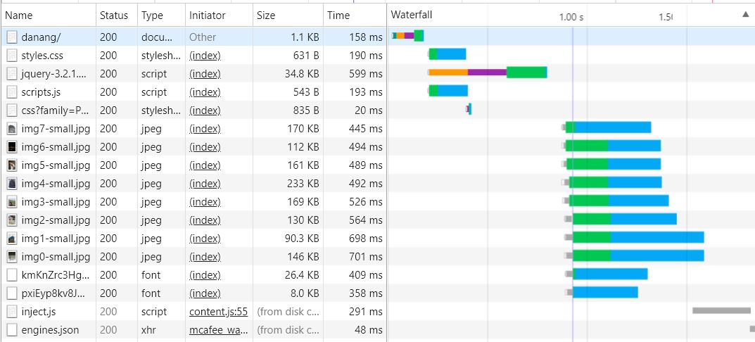
I used gulp library
gulp-imageminto help me optimize my images. However, the size of images dropped by 10% at most. -
Thanks to Jiayu, I used Imagick to convert and resize the images using the command
convert *.jgp -resize 700x700. It was super effective! Image size dropped by 90% and the resolution didn’t affect the quality of the image much because the image was rendering at a smaller size by the browser anyway. -
For exploration next time: the use of srcset attribute in
to load different assets based on the different screen resolutions.
It took about 1.5s in the new page load! Ok not that fantastic but yay! It does motivate people to do more :)
Final Words
IM GLAD I GOT IT OUT. Check out the repo?
Did you know this was built with 11ty and tailwind? And works even with Javascript disabled? Yeah I don't care either.