CSS Grids got me blocked up
Okay so was working on improving the UI of the flexbox sandbox page when I was like "Hm I want to have one column that spans two rows, I wish I had grid knowledge. Oh now might be a good time to learn CSS grids!"
Then I figured how ironic it would be to use CSS Grids to do the layout of a Flexbox Sandbox (LOL)
Okay some simple HTML code to help set up real quick.
<style>
.box {
    padding: 20px;
    background: lightblue;
}
</style>
<div class="wrapper">
    <div class='box'>A</div>
    <div class='box'>B</div>
    <div class='box'>C</div>
    <div class='box'>D</div>
    <div class='box'>E</div>
    <div class='box'>F</div>
</div>
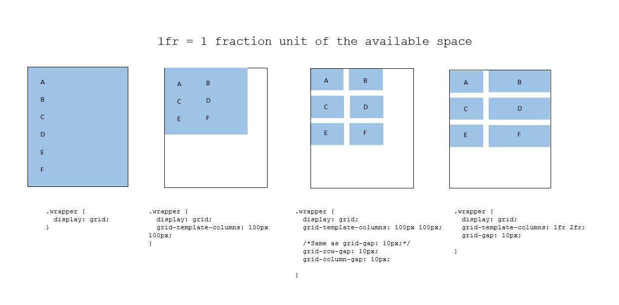
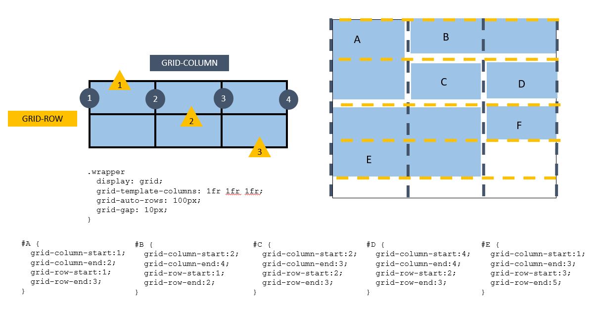
Here's just the simple grid attributes you need to know for a basic understanding!
- grid-template-columns
- grid-auto-rows
- grid-gap
- grid-column-start/end
- grid-row-start/end


Well, that's all to know for a truly basic and 5 minute understanding of CSS grid. This is probably like hovering on the surface (shall not even attempt to say scratch the surface) so I'll see if there's a need for a more detailed one next time! Tooodlesss.
Did you know this was built with 11ty and tailwind? And works even with Javascript disabled? Yeah I don't care either.