Pure CSS Images
!!! This is like one of my more exciting projects for me.
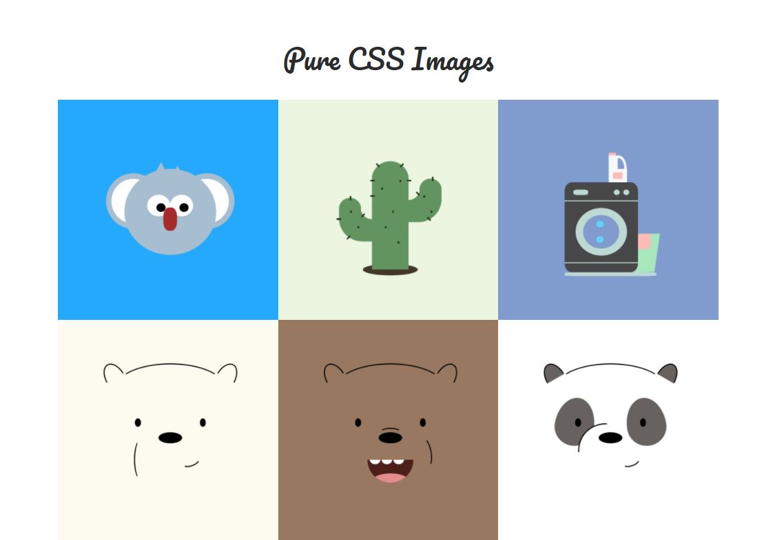
Was in school studying one day when I came across this medium article on CSS images. It was quite fun and I just wanted to try things out.
So it involved into a side project in which I aim to add one .. every week? Haha. I'm also trying to use this chance to learn some css/js tricks.This post is also meant to tell the story of how the pictures came about.
Cactus
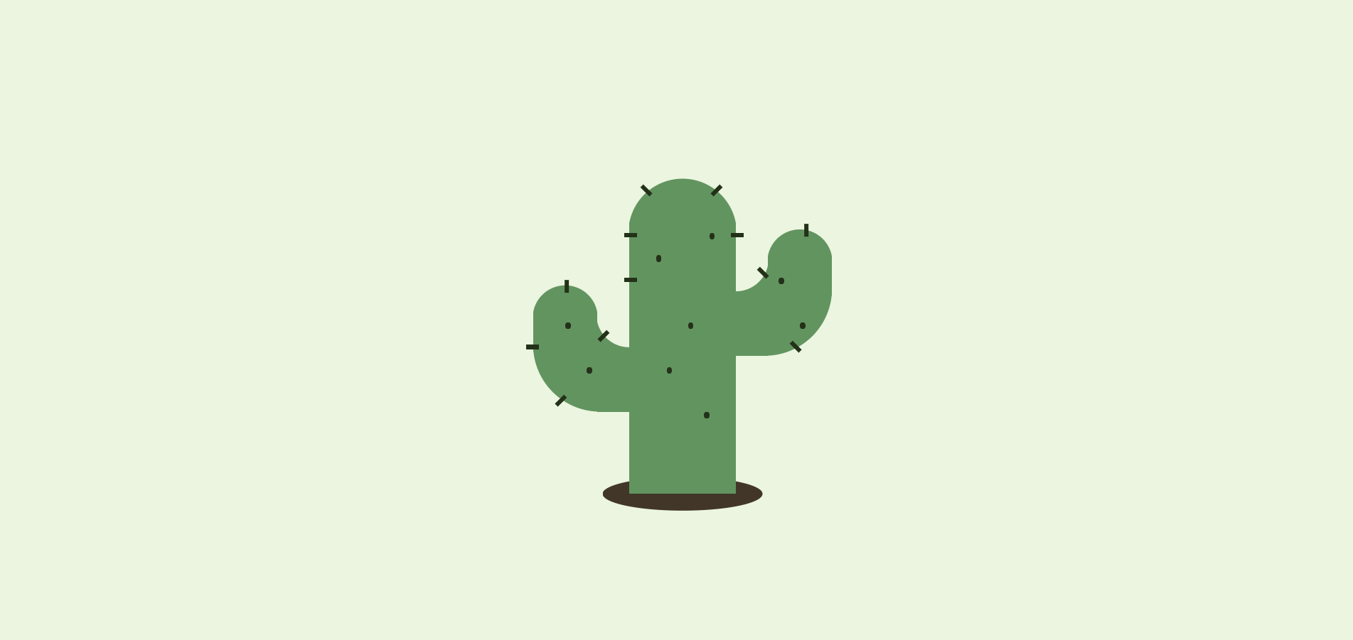
This was the first image I've worked on post-reading of the medium article. I liked cactus (!!! I have 3 pots at home and I water them once a week - is that sufficient?!). It was quite a good exercise when starting out. Due to the many spikes and dots, I utilised mixins!
And this color generating tool and clippy!!
@mixin make-spike-tl($top, $left) {
    position: absolute;
    background-color: $dark-green;
    width: 12%;
    height: 2%;
    left: $left;
    top: $top;
}

.spikes-1 {
    @include make-spike-tl(0%,-5%);
}
Washing Machine
I actually did this in the same day of cactus. Haha, it was to rebel against school work (capstone oops if you get what I mean). First image to use CSS3 animations, have to say its pretty neat of CSS3 to have basic animations like that! No need for js!
.water-1 {
    animation: orbit 4s linear infinite;
}

@keyframes orbit {
    from { transform: rotate(0deg) translateX(110%) rotate(0deg); }
    to   { transform: rotate(360deg) translateX(110%) rotate(-360deg); }
}
WE BARE BEARS !!!
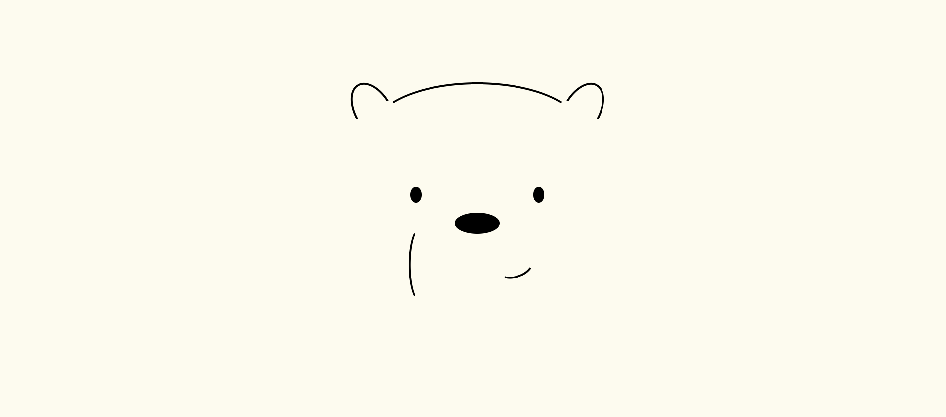
BECAUSE THEY'RE SO CUTE?! SORRY THIS HAS TO BE IN CAPS COS I NEED TO CONVEY THIS PARTICULAR MESSAGE.
That being said, the arcs were very annoying. It was pretty much a trial-and-error thing. And learning about border-radius, having a difference wih % and px and how the 50%/50% thing came about.
PS. Icebear for the win.
Turtwig
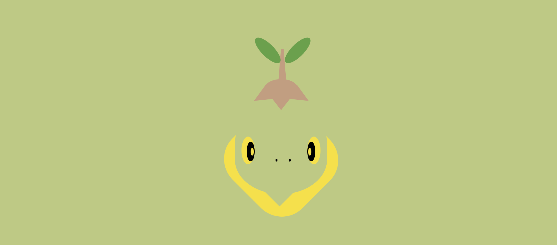
Go play Mystery Dungeon! This was so hard too, because of the particular shapes and the difficulty to create sharp edges... Turned out quite weird but that's the best I could do. Working on other Pokemon but I tell you it's hard, it gave me several roadblocks ><
Astronaut
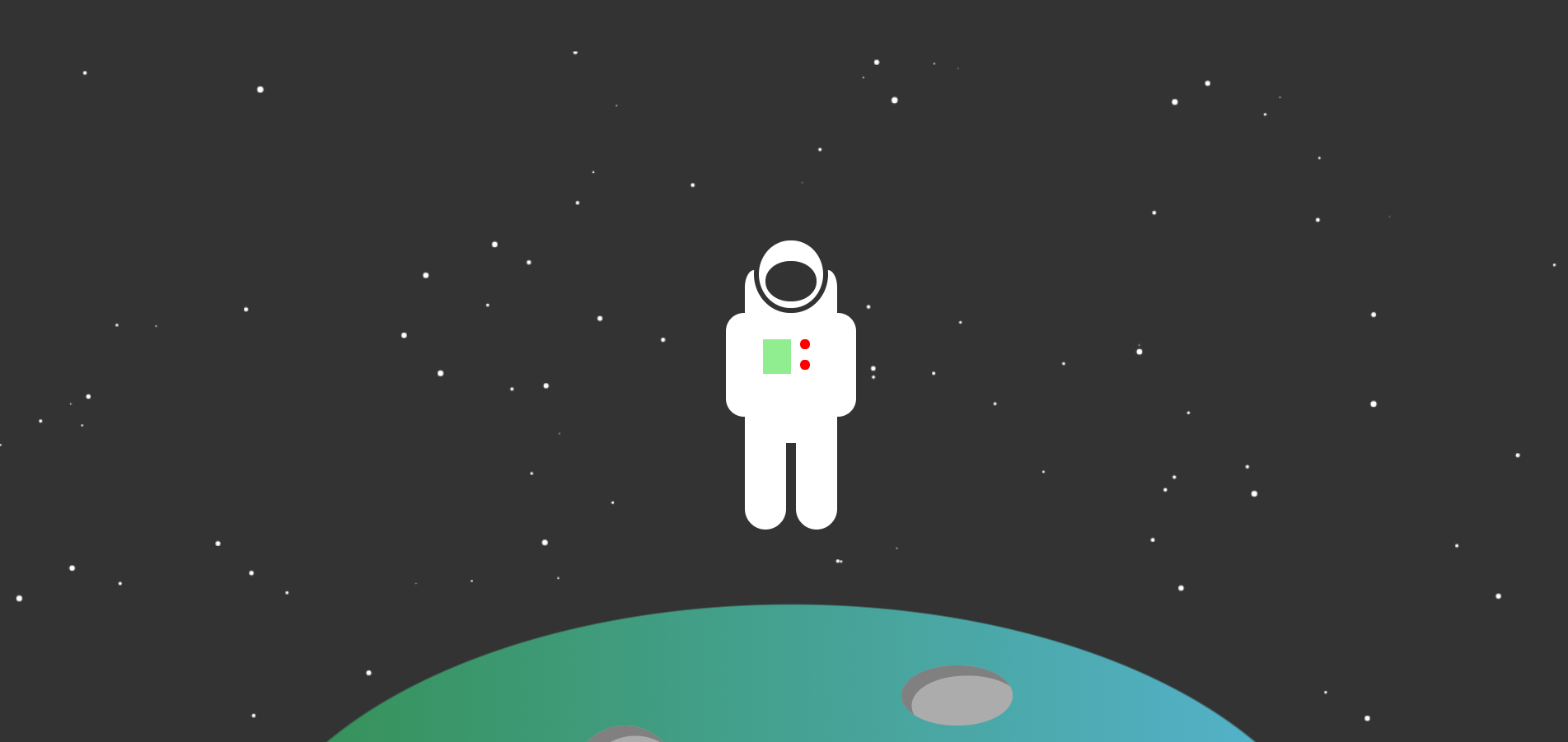
LOL I took almost an entire day for this! Used HTML5 Canvas to create the background full of starss and a cool function I ripped off to create the auto-scrolling behavior. First image with javascript and I need to get used to the const and => functions haha. Also started to experiment with different css selectors like div:nth-child(even|odd|n-1), div:first-child, div:last-child. It is really convenient! Looking forward to less tedius and more ingenious CSS tricks. Also loving the linear-gradient in CSS3 and used box-shadow inset to create the holes.
And also wanted to do this astronaut, because I was inspired by 五月天 的 顽固, check out this Taiwanese BAND THEY ARE ABSOLUTELY GENIUS AND their MVs always make me cry. It's a bid to persevere and don't let dreams die out! It's important to fight for yourself!
Upcoming Ideas
- Incorporating Vuejs
- More CSS/JS animations
- More Graphic Designish things
Did you know this was built with 11ty and tailwind? And works even with Javascript disabled? Yeah I don't care either.